
This post contains affiliate links. If you buy through them, I may earn a commission at no extra cost to you.
Gray had a decade. Stark white had its moment. And now every mood board, showroom, and Pinterest feed is pointing at the same place: caramel, that sun-warmed spectrum between butterscotch, toffee, and toasted almond that makes a room feel like golden hour all day.
The best part? Caramel isn’t a color you have to commit a paint can to. It’s a layer. Here’s how to bring it home, whatever your budget.
Why caramel, and why now
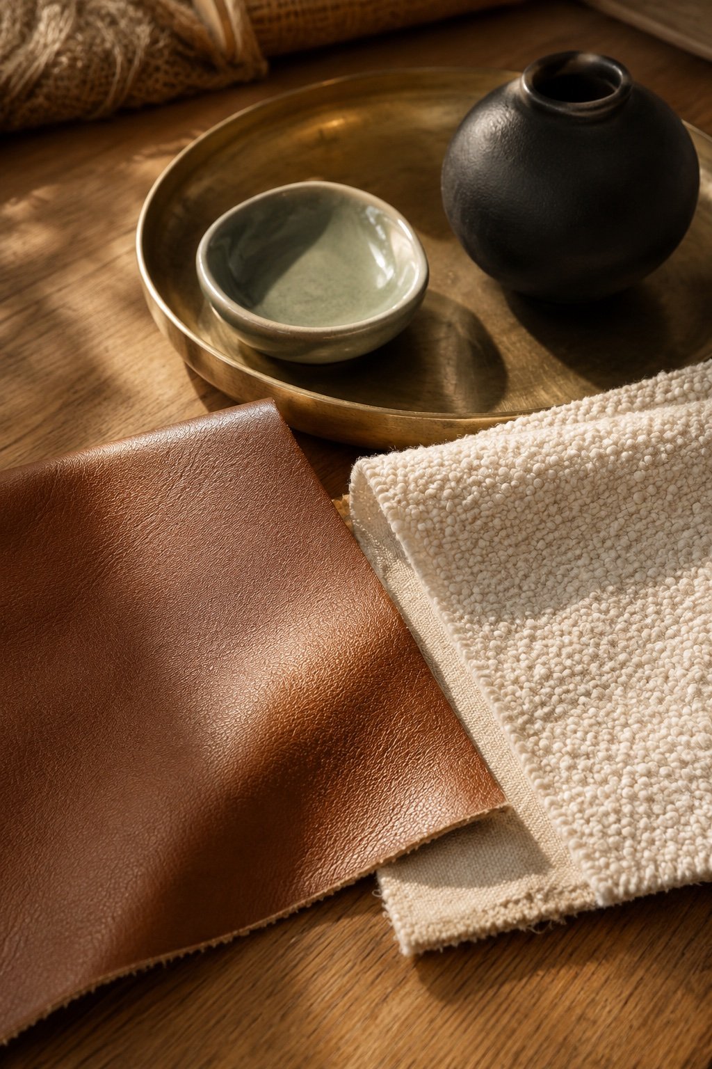
Warm neutrals have been building for years, but 2026 is the tipping point: designers are calling caramel and “caramelized beige” the defining tones of the season, showing up on walls, upholstery, and cabinetry alike. After years of cool gray interiors, people want rooms that feel human again, and caramel flatters wood, skin tones, and lamplight like nothing else.
It also plays perfectly with the other big trend of the moment: natural, foraged texture. Dried stems, rattan, unfinished oak: caramel is their native color family.
The palette: what caramel loves
Caramel is friendly, but it has favorites:
- Cream and ivory: the classic pairing. Caramel on cream looks warm; caramel on bright white looks orange. Choose your whites soft.
- Chocolate and espresso: deeper browns give caramel its backbone. Think a dark leather chair or walnut frame.
- Sage and olive: the green that keeps a caramel room from feeling monochrome.
- Brass and amber glass: warm metals amplify the golden undertone.
- Black, in small doses: a matte black lamp or frame sharpens all that softness.
What to avoid: cool grays and blue-whites. They don’t fight caramel loudly; they just drain it.
Caramel and white
Caramel and white work when the white is warm. Look for whites with a creamy or yellow undertone, the kind that looks faintly buttery next to printer paper, and keep caramel as the accent: roughly one part caramel to three parts white. The result reads fresh and golden instead of stark and high-contrast.
Caramel wood tones
Honey oak, teak, and warm cherry are caramel in wood form, which is why they sit so easily in this palette. Let one of them lead and add a single darker walnut piece for depth. If your room already mixes several woods, our guide to mixing wood tones shows how to make them look intentional.

Room by room: the caramel starter kit
Living room
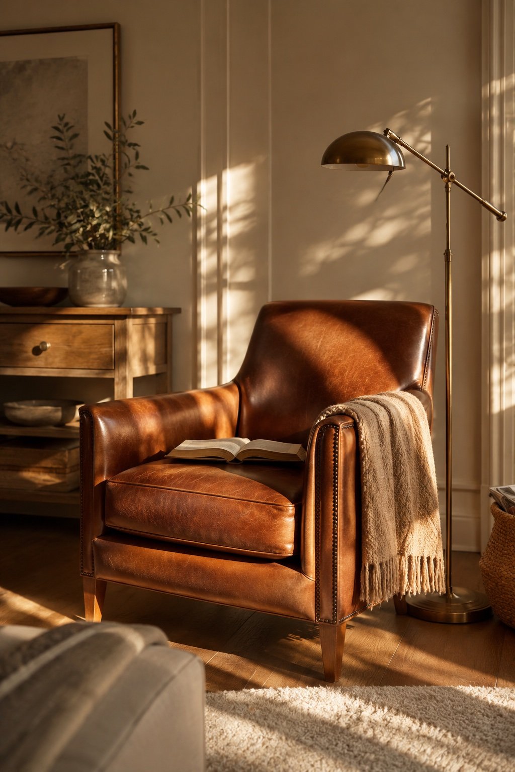
The easiest entry point is textile-first: a caramel throw over a neutral sofa, two toffee-toned pillow covers, or, the bigger move, a cognac leather accent chair, which is essentially caramel with a resume. If you’re rug shopping, warm-undertone jute and wool blends do the work from the floor up. For a full seasonal version, see these cozy fall living room ideas.
Shop the idea
A caramel chunky knit throw
The textile-first move in one piece: an open chunky knit in true caramel, small enough to drape over a sofa arm or fold at the foot of a bed. Machine washable.
Bedroom
Caramel bedding is having a genuine moment: a washed-linen duvet in butterscotch against ivory sheets looks like a boutique hotel in Marfa. If that’s too much, start with a caramel lumbar pillow and a camel throw folded at the foot of the bed. For a calmer, pared-back take on a caramel color bedroom, see these warm minimalist bedroom ideas.
Kitchen and dining
Wood tones count as caramel here: oak stools, a walnut cutting board leaned against the backsplash, amber glass jars on open shelves. Café curtains in unbleached linen carry the tone without a renovation.
Walls, if you’re ready
Caramelized beiges and soft toffees are the wall colors of the year. Test large swatches and check them at night: caramel paint deepens beautifully under warm bulbs, which is exactly when you’ll live with it most.
Shop the idea
Dimmable 2700K bulbs (sold as soft white)
The cheapest fix in this post. At 2700K, the tone US brands label soft white, caramel walls and textiles stay golden at night instead of going gray-brown.
When you choose a warm caramel paint color, look at the undertone first. Caramels that lean yellow feel sunny and casual; those that lean red feel richer and more traditional. A matte or eggshell finish keeps the color soft, and in a room with little natural light, go a shade lighter than you think, because caramel walls deepen as the day ends. A good warm lighting plan does the rest.

Budget vs. investment: where caramel is worth real money
Spend little: pillow covers, throws, candles, dried stems, printable art. Caramel accents are trend-proof because they read as “warm neutral,” not “2026.”
Spend more, wisely: a cognac leather chair, a warm-toned wool rug, or quality linen bedding. These are decade pieces: caramel leather in particular only improves as it ages.
Skip: caramel-colored plastic or shiny synthetic velvet. This trend is about warmth and material honesty; a glossy fake version reads instantly wrong.
Three mistakes that flatten the look
- All caramel, no contrast. Without cream to breathe and something dark to anchor, caramel turns into a beige fog. Keep the 70/20/10 rule: mostly light neutrals, then caramel, then dark accents.
- Cool lighting. A 4000K bulb will turn your toffee wall gray-brown. Warm white (2700K or below) is non-negotiable.
- Matching everything. Caramel’s charm is its range: butterscotch next to camel next to cognac. Three shades of it always beat one exact match repeated five times.
The bottom line
Caramel is the rare trend that’s really a return: to warmth, to wood, to rooms that flatter the people in them. Start with a throw and a bulb swap this weekend. If you fall for it the way most of us have, the leather chair can be the holiday-sale reward.
Read next: 27 cozy fall living room ideas that feel warm, not cluttered.
Keep Reading
📖 27 Cozy Fall Living Room Ideas That Feel Warm, Not Cluttered
📖 How to Mix Wood Tones Without It Looking Like an Accident
📖 Black Accent Walls: How to Make Them Feel Warm, Not Heavy