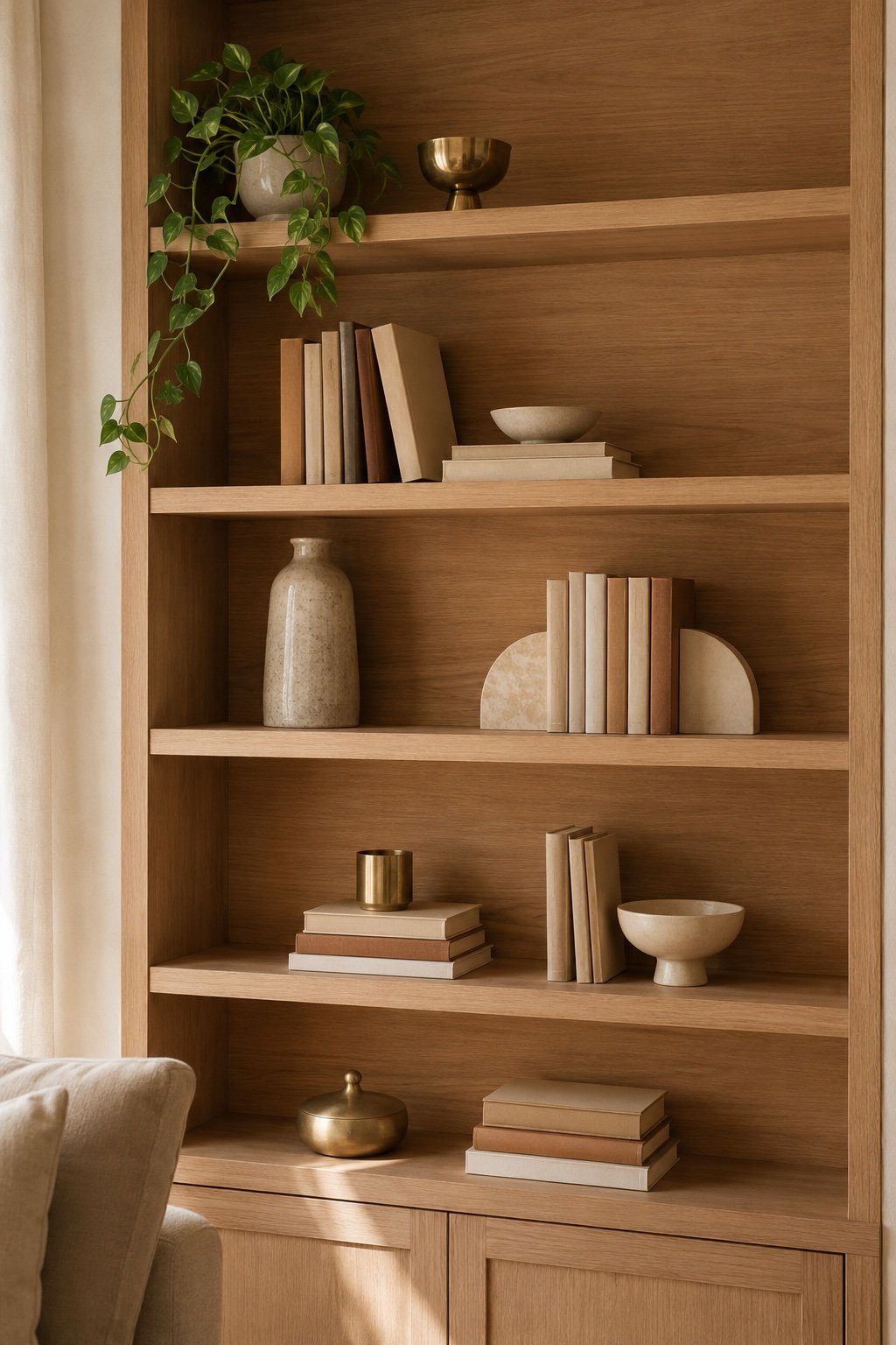
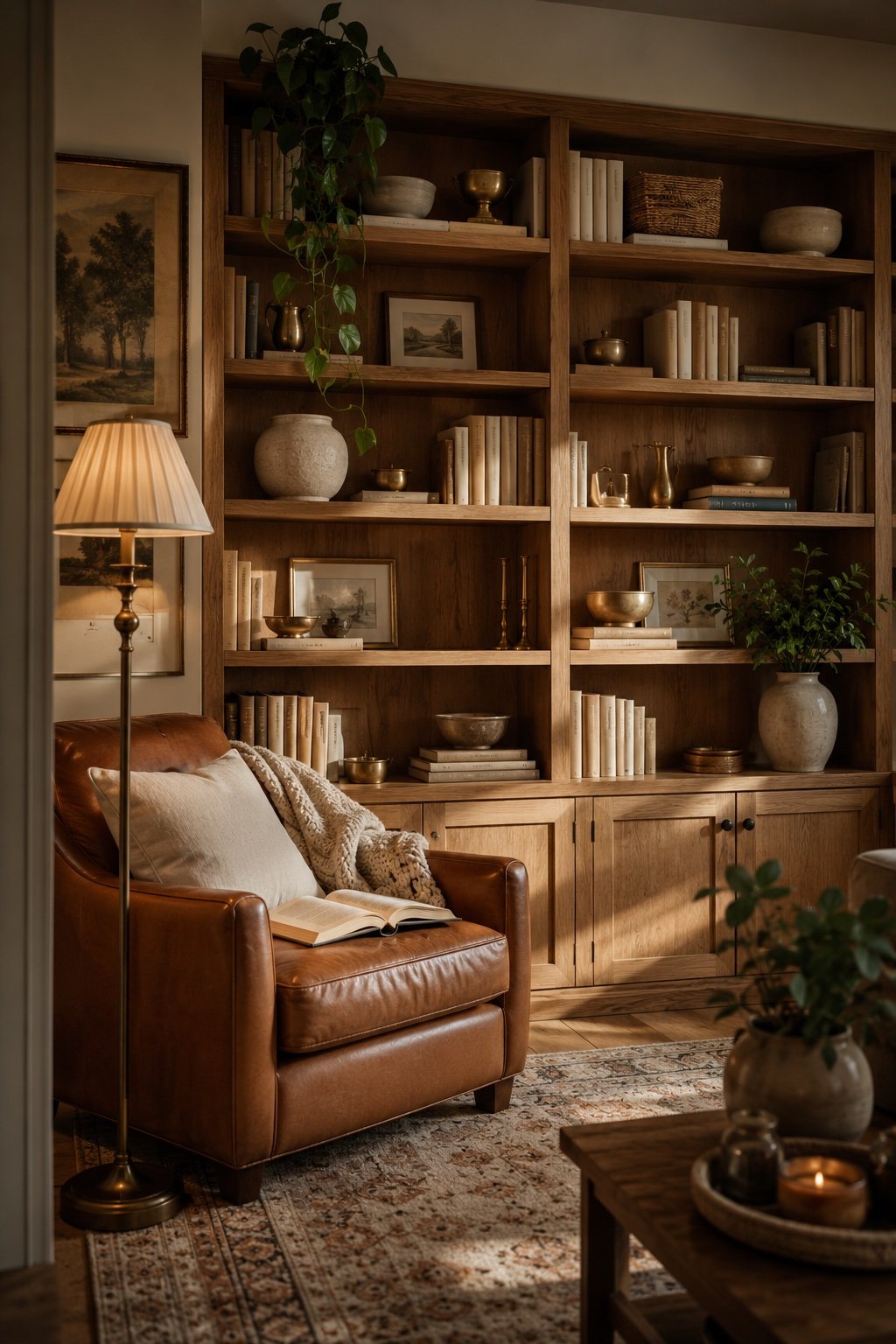
There’s a particular frustration in owning nice things, arranging them on a shelf, and having the whole thing look like a yard sale. Meanwhile the shelves in magazines hold roughly the same objects and somehow read calm and collected. The difference isn’t the objects. It’s a handful of rules that stylists apply without thinking, and once you know them you can’t unsee them.
Why the rule of three works
Odd numbers are harder for the eye to resolve into a pattern, so it lingers a beat longer. Two objects read as a matched pair, symmetrical and static. Three read as a composition, and your eye travels between them. That’s the whole trick, and it’s why groupings of three, five, or seven look considered while groupings of four look like inventory.
Applied to a shelf, this means: group in threes, vary the heights within each three, and give each group room to be its own thing.
The three shapes every group needs
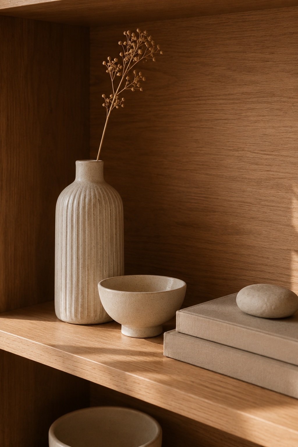
Every good vignette has these, and it’s worth checking each group against them:
- Something tall to set the height. A vase, a stack of books stood upright, a small lamp.
- Something round or organic to soften the straight lines shelves are made of. A bowl, a sphere, a bud vase, a plant.
- Something low and horizontal to anchor the base. A flat stack of books, a box, a tray.
Tall, round, low. Once you’re looking for it, you’ll see it in every styled shelf you’ve ever admired.
The rules that do the heavy lifting
1. Leave a third of it empty
This is the hardest one and the most important. Negative space is what tells the eye that the objects were chosen, not accumulated. If every inch is full, nothing stands out. Aim for roughly one third of the shelf surface visible and empty.
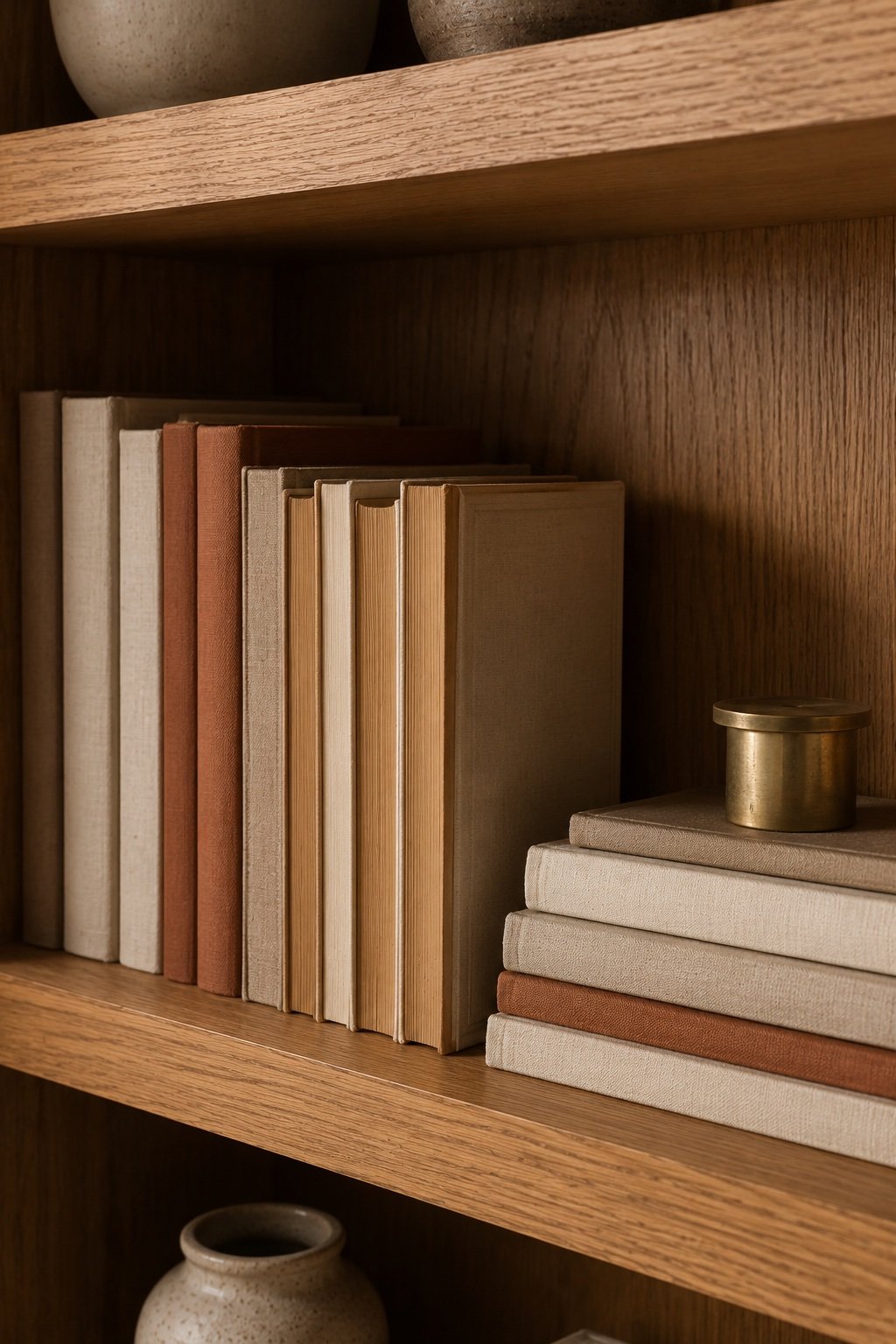
2. Stack books both ways
Some upright, some flat in a horizontal stack with an object on top. The horizontal stacks break the rhythm of vertical spines and make natural pedestals for small pieces.
3. Turn the loud spines around
If your books are a riot of publisher colors, you don’t have to buy new ones. Turn a few backward so the pages face out, or pull the jackets off. Cloth covers and paper edges read as texture instead of noise. Don’t do the whole shelf backward though. That reads like a stage set.
4. Repeat one material three times
A shelf feels cohesive when a material shows up in at least three places, spread apart. Three touches of brass, or three of oak, or three of ceramic in the same clay tone. The repetition is what your eye reads as intentional.
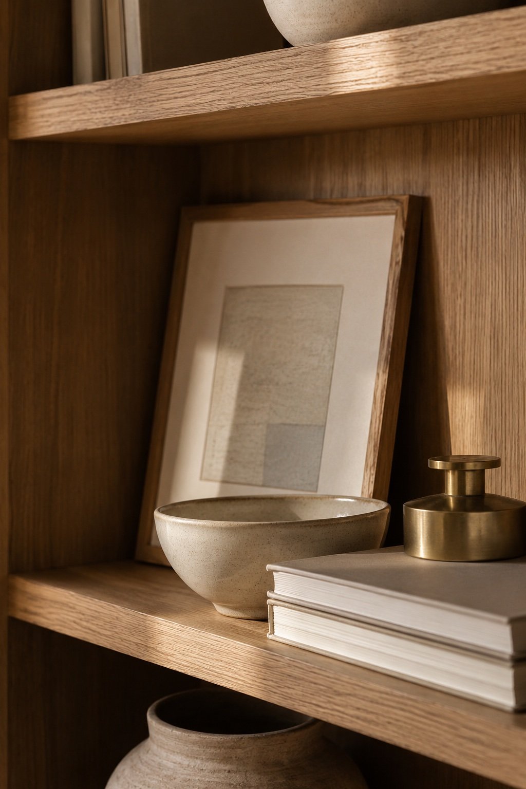
5. Vary the depth
Don’t line everything up flush at the front edge like books on a store display. Push some pieces back, let others come forward, lean a small framed print against the back wall with a bowl in front of it. Depth is what turns a shelf into a scene.
6. Work in diagonals
Look at the whole bookcase, not the individual shelves. If you place your three brass objects roughly on a diagonal across the unit rather than stacked in a column or lined up in a row, your eye moves through the whole thing.
How to actually do it
Empty the shelves completely. All of it, onto the floor or a bed. Styling around what’s already there never works because you keep making peace with pieces that shouldn’t be there.
Then sort into piles: books, tall things, round things, low things, frames, plants. Now you can see what you actually own.
Start with books, because they’re the volume. Distribute them across the unit in both orientations, leaving gaps. Then place your tallest pieces, spread apart, never two on the same shelf next to each other. Then the round softeners. Then the low anchors. Then step back, across the room, and take a photo with your phone.
The photo is the honest part. A camera flattens the shelf into two dimensions and the imbalances jump right out.
What to leave out
Some things are just not shelf material, and putting them there is why the shelf never quite lands:
- Tiny objects that read as clutter from six feet away. If you can’t identify it across the room, group it in a bowl or put it away.
- Anything with a cord unless the cord can hide. A lamp is worth the cord. A charging dock isn’t.
- Too many frames. Two or three across a whole unit, not one per shelf.
- Plastic. Even good plastic reads cheap under a shelf light. This is the one place to be a snob about material.
The greenery question
One plant per shelving unit, maybe two if it’s tall. A trailing pothos on the top shelf softens the whole thing because the line breaks the grid. More than that and you’ve got a nursery, not a shelf. If your light is bad, one good faux trailing stem in a real ceramic pot is a defensible cheat. Nobody looks that closely at the top shelf.
The five-minute upgrade
If you don’t want to empty everything, do this instead. Remove a third of what’s on the shelves, at random, and put it in a box. Turn three loud book spines around. Lay two vertical stacks down flat and put a small object on each. Step back.
Most shelves aren’t badly styled. They’re just overfull.
The takeaway
Group in threes, use tall plus round plus low in each group, and leave a third of it empty. Every other rule here is a refinement on those. Get the three basics right and the shelf will look like you know what you’re doing, which, by then, you will.
Keep Reading
📖 Warm Lighting 101: The Three-Light Rule Every Room Needs
📖 How to Style Your Coffee Table for Fall (5 Easy Formulas)
📖 How to Mix Wood Tones Without It Looking Like an Accident