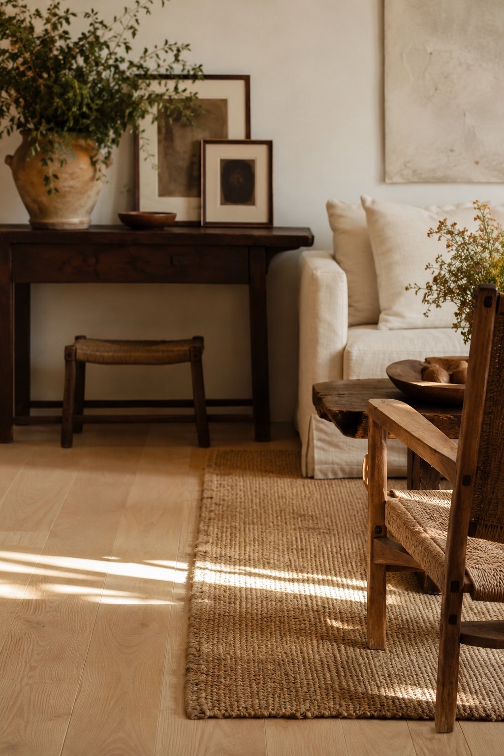
Almost nobody furnishes a house in one wood. You inherit an oak table, you buy a walnut dresser, the floor is whatever the last owner chose, and the kitchen cabinets are a color nobody has a name for. Then you read somewhere that wood tones should match, look around, and decide the whole room is a mistake.
It is not. Matching every wood in a room is a furniture showroom trick, and showrooms look like nobody lives there for exactly that reason. What you want is not sameness. It is a room where the woods look chosen rather than accumulated, and there are four rules that get you there.
First, learn to see undertone instead of color
Every wood has an undertone hiding under its surface color, and undertone is the thing that actually clashes. There are three families:
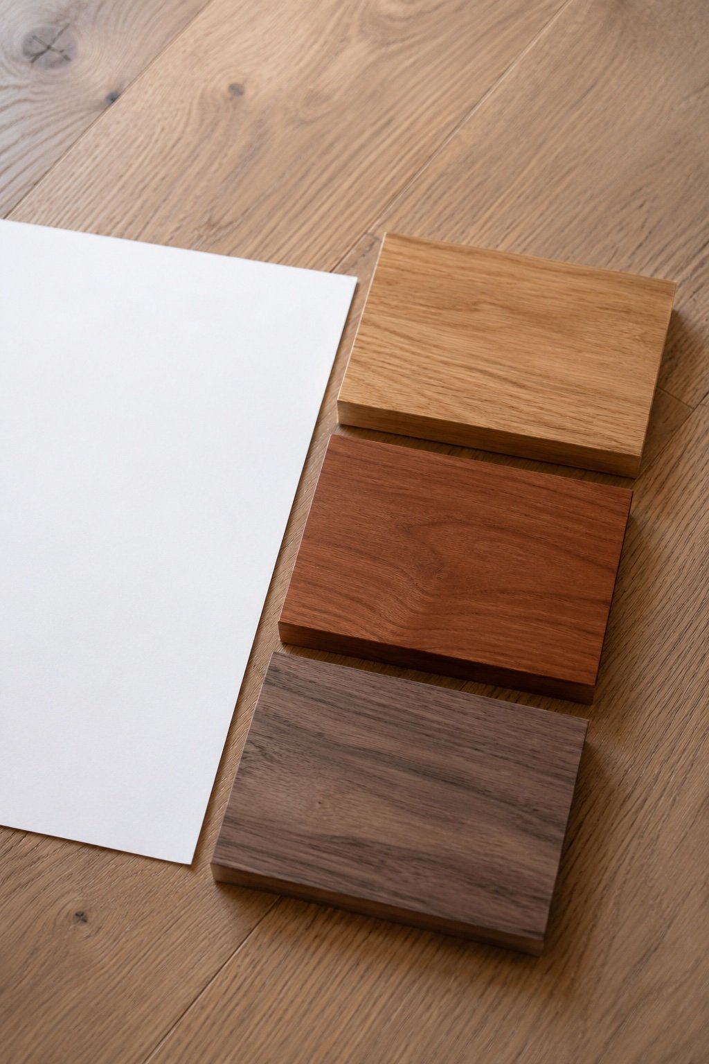
- Warm / red. Cherry, mahogany, some older oak, a lot of 1990s furniture. Reads pink or orange in daylight.
- Warm / yellow-gold. White oak, pine, maple, birch, most current furniture. Reads honey or caramel.
- Cool / gray-brown. Walnut, gray-washed oak, weathered teak, ash. Reads taupe or almost purple in shadow.
Here is the fast way to see it. Put a plain sheet of white printer paper flat on the wood in daylight. The paper cancels out your eye’s guessing, and whatever the wood does against pure white is its undertone. Pink, gold, or gray. Do this with your floor, your table, and one piece you are unsure about, and half the mystery evaporates in a minute.
Clashes almost always come from mixing red undertones with gray undertones in the same sightline. Cherry next to gray-washed oak fights. Cherry next to walnut is fine. That is the actual rule underneath all the vague advice.
Rule one: pick a dominant wood
One wood runs the room. In most houses that decision is already made for you: it is the floor, because it is the largest continuous wood surface you own. Everything else is a supporting player.
Once you know your dominant wood and its undertone, you have a job for every other piece: relate to it or contrast with it deliberately. What you want to avoid is the third option, which is nearly matching. A table that is almost the same shade as the floor but not quite is the only combination that genuinely looks like an error, because the eye reads it as a failed attempt rather than a choice.
So if your floor is honey oak, do not buy a table in slightly-different honey oak. Go clearly darker, clearly lighter, or paint it.
Rule two: aim for contrast, not harmony
Two woods that look great together are usually several shades apart. Light oak with walnut. Pale ash with dark stained pine. Honey pine with near-black. The gap is what makes both of them look intentional.
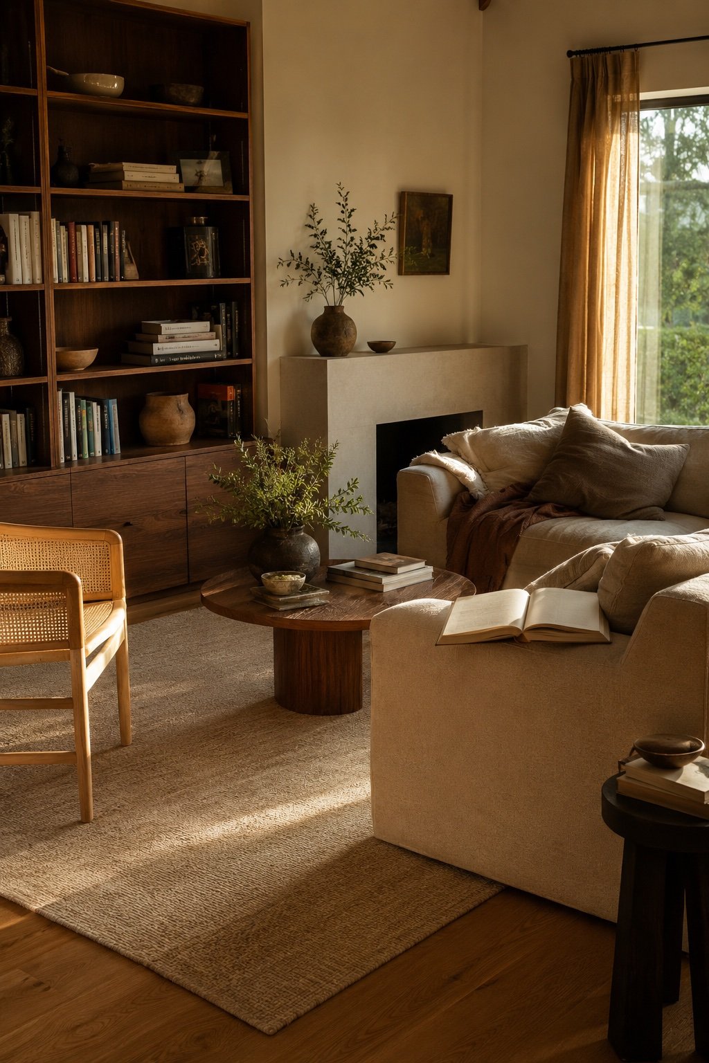
A useful test: squint at the room. If the woods blur into a single beige mass, there is not enough contrast and the room will look flat in photos and dull in person. If you can still count three distinct values (light, medium, dark), you are in good shape.
Three wood tones is the practical maximum for a normal room. Two is calm. Three is collected. Four starts needing a very strong hand to hold together, and by five you are back to accumulated.
Rule three: repeat every wood at least once
This is the rule that does the most work and the one people skip. A single walnut piece in an oak room looks like it wandered in from another house. That same walnut piece plus a walnut picture frame plus a walnut bowl on the coffee table looks like a decision.
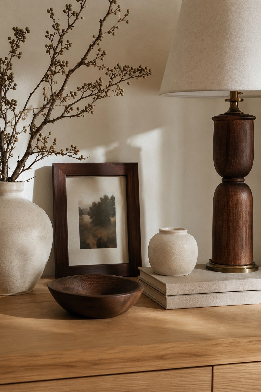
The repetition does not have to be furniture. It almost never should be. Small things carry the tone perfectly well:
- A picture frame or two
- A wooden bowl, tray, or cutting board left out
- Lamp bases and candlesticks
- The legs of a stool, or the arms of a chair
- A mirror frame
- Curtain rod finials, which nobody notices and everybody registers
Two or three appearances of a tone, spread across the room at different heights, is enough. Once your eye finds a wood twice, it stops reading it as a stray.
Rule four: separate with something that is not wood
Woods that fight when they touch usually get along with a buffer between them. This is why a room with a rug, textiles, and metal in it can carry wood combinations that would look wrong on a bare floor.
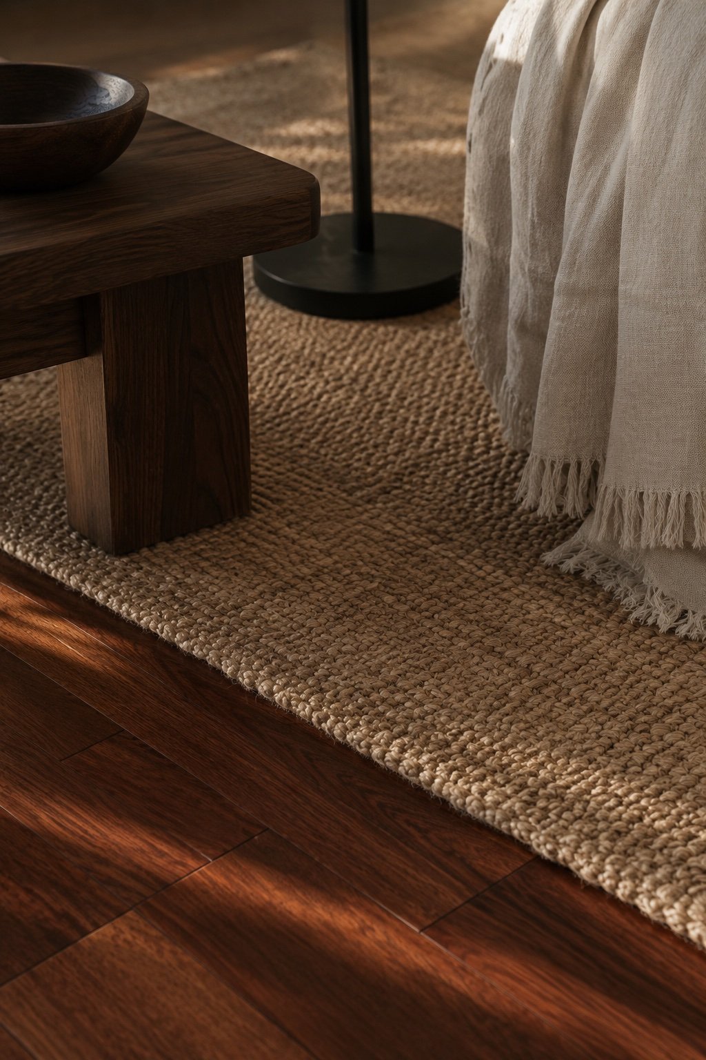
The buffers that work:
- A rug. Sized correctly for the room (the size guide is here), it is the single best separator, because it physically breaks the line between the floor and the furniture legs standing on it. A jute or wool rug in a neutral will make a walnut table sit peacefully on a red-toned floor.
- Textiles. A linen runner on the table, a throw over the chair arm, curtains that break up a wall of built-ins.
- Metal. Brass, black, or bronze repeated a few times gives the eye something else to follow. Warm metals bridge warm woods; black bridges anything.
- Paint. One painted piece in the room, in cream, clay, or near-black, acts like a full stop between two woods that were arguing.
- Stone or ceramic. A marble lamp base, a stoneware vase, a travertine tray.
What about the floor you cannot change
Renting, or living with a floor you did not pick and cannot replace. This is the most common version of the question, and the answer is almost always the same: stop trying to match it and start burying it.
An orange-toned floor from 1998 is only a problem when it is the star. Put down a large neutral rug, bring in furniture that is either clearly darker or clearly lighter than the floor, add cream and black in the textiles, and the floor becomes background. You do not have to like your floor. You have to stop making everything else agree with it.
The same goes for kitchen cabinets in a wood you did not choose. Repeat the cabinet tone once, in a cutting board or a stool, so it looks intentional, and then let the countertops, hardware, and open shelves carry the actual palette.
The five minute version
If you only do one pass through the room, do this one.
Identify the dominant wood, which is probably the floor. Put a piece of white paper on it and name the undertone. Find the piece that is closest to it without matching, and either move it to another room or plan to change it. Take the wood tone that appears exactly once and give it a second and third appearance somewhere small: a frame, a bowl, a lamp. Then put a rug down.
Mixed woods are how real houses look. A room where every wood matches is a room somebody bought in one afternoon, and it never quite reads as home.
Keep Reading
📖 Bookshelf Styling: Why the Rule of Three Actually Works
📖 How to Style Your Coffee Table for Fall (5 Easy Formulas)
📖 Gallery Wall Ideas That Don’t Look Like a Mood Board