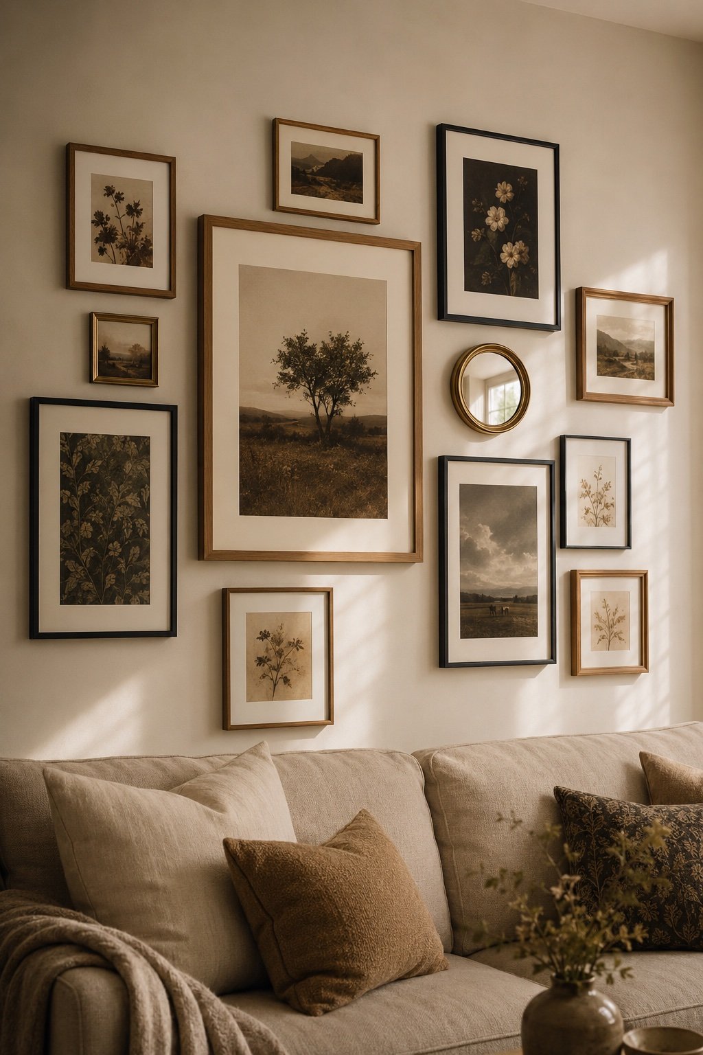
Gallery walls went through a phase, and we all know what it looked like: nine identical black frames in a perfect grid, filled with the prints that came in them, hung over a gray sofa. It read as a decorating decision rather than a wall of things someone loved. The version that lasts looks like it happened over years, and it’s built with rules that are more forgiving than the grid ever was.
Start with what you’d keep in a fire
The single reason most gallery walls look generic is that they’re filled with art bought to fill them. A wall assembled in one shopping session looks like it, no matter how good the pieces are individually.
So start from the other direction. What do you already own that means something? A photo you took. A print from a trip. A postcard, a letter, a kid’s drawing that’s genuinely good, a menu from a night that mattered, a small textile, a page torn from a book. Those go up first, and they are what make the wall yours.
Then buy to fill the gaps, not to build the whole thing. If you own three meaningful pieces and buy four to round it out, the wall reads personal. Reverse the ratio and it reads like a catalog.
Mix the frames, but not randomly
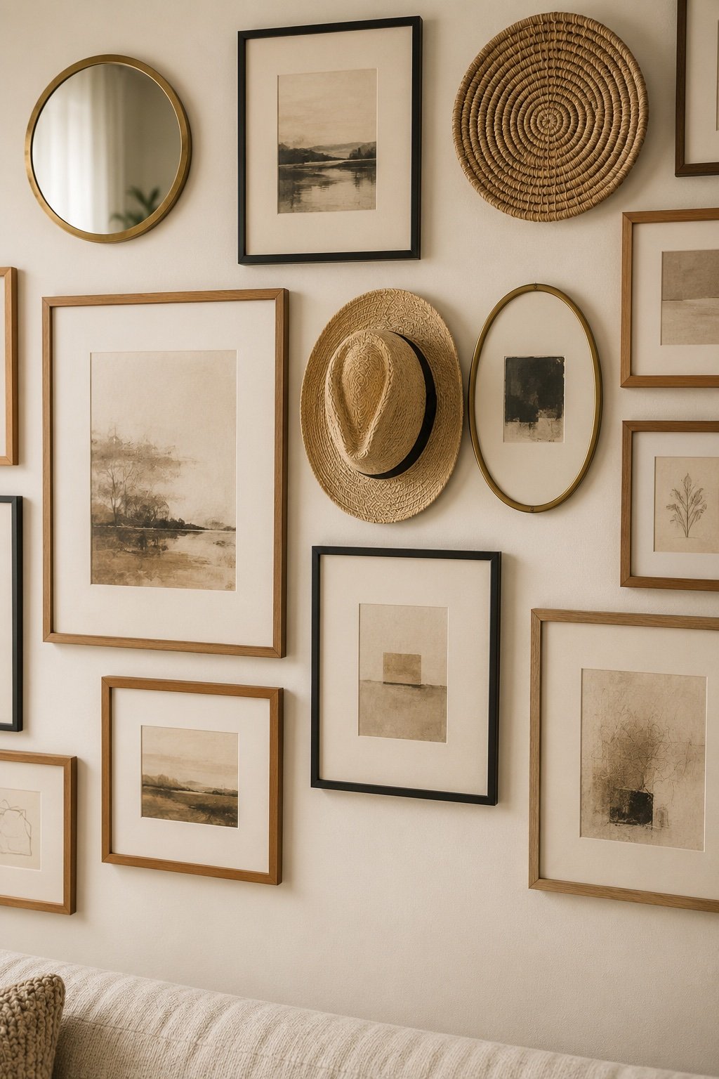
Matched frames read formal and a little corporate. Fully random frames read like a thrift store. The version that works is a controlled mix: two or three frame finishes, repeated across the wall.
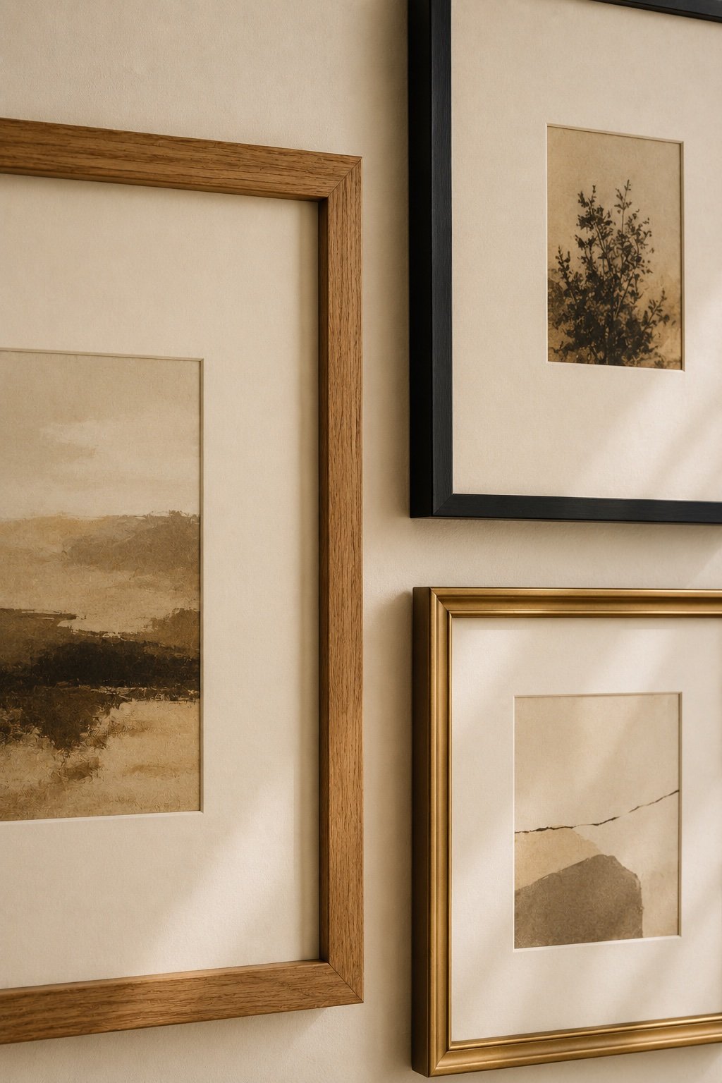
A reliable combination: warm oak, thin black, and a touch of brass or gold. Each one appearing at least three times, spread out rather than clustered. The repetition is what tells the eye it was intentional and the variety is what stops it being a grid.
What ties a mixed set together is mats. Generous white or cream mats around small pieces do two things: they make cheap art look considered, and they give the whole wall a shared visual language even when the frames differ. A big mat around a small print is the most underrated move in framing.
Vary the sizes, hard
Nine same-size frames is the grid problem. You want one clearly dominant piece, two or three mediums, and a handful of smalls. The eye needs somewhere to land first and then somewhere to wander.
If everything you own is roughly the same size, fix it with mats and frames rather than art. An 8 by 10 print in a 16 by 20 frame with a wide mat becomes a medium piece. Same art, different weight.
The layouts that work
The organic cluster
The one that reads collected. Pieces of varying size arranged with a consistent gap, growing outward from a central anchor. Hardest to get right and best when it lands. The key is the gap, not the alignment.
The salon wall
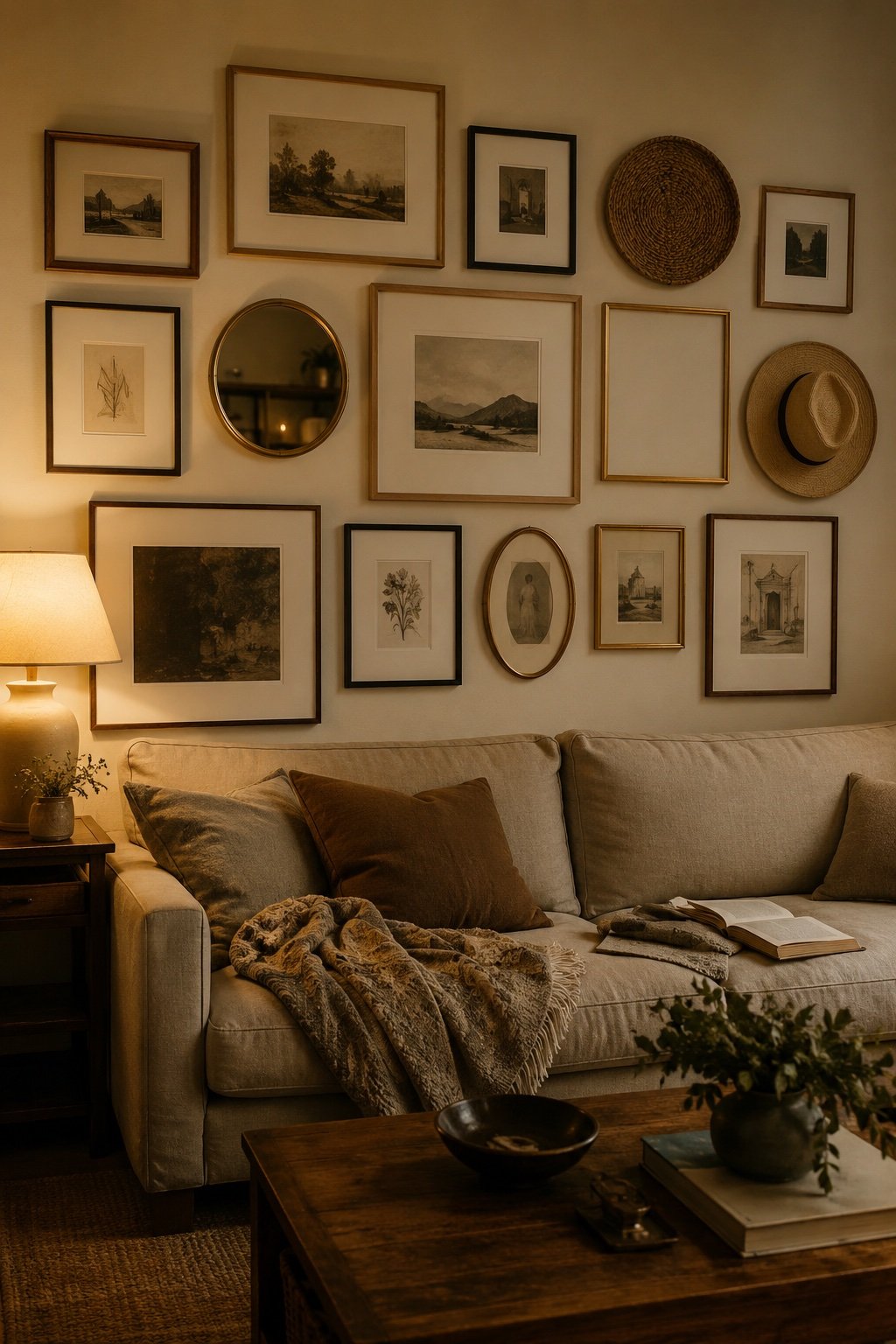
Floor to ceiling, dense, filling a whole wall. It needs a lot of pieces and real nerve. Extraordinary in a stairwell or a dining room, and the one layout where more is genuinely more.
The line
A single horizontal row, centers all at 57 inches, above a sofa or along a hallway. Calmest, easiest, and almost impossible to get wrong. If you’re nervous, do this.
The ledge
Picture ledges instead of hanging. Two ledges, art leaned and overlapped. You can change it whenever, there are two holes in the wall instead of twenty, and the overlap creates depth a flat wall can’t. The best option for renters and for anyone who’s not sure.
The gap is the whole game
If you take one rule from this: keep a consistent gap between every frame, and make it small. Two to three inches, everywhere, regardless of frame size.
A consistent tight gap is what makes a cluster of unrelated pieces read as one object rather than scattered frames. It’s also the thing that’s wrong in ninety percent of gallery walls that feel off. Too much air between frames and the group dissolves. Uneven gaps and the eye keeps snagging.
Three inches for a normal wall, two for a dense cluster. Cut a piece of cardboard to the gap and use it as a spacer as you go.
Where the whole thing sits
- The center of the arrangement sits at 57 to 60 inches from the floor. Not the center of the biggest piece. The center of the whole group treated as one rectangle.
- Over a sofa, leave 6 to 8 inches between the sofa back and the bottom of the lowest frame. More and they float apart. Less and they look propped.
- The width of the arrangement should be roughly two thirds of the furniture below it. A narrow cluster over a wide sofa is the most common proportion mistake there is.
- In a stairwell, follow the rake of the stairs rather than leveling to the floor. Measure up from each tread.
Do the paper thing
Don’t freehand it. Trace each frame onto kraft paper or newsprint, cut them out, mark where the hook falls on each, and tape them to the wall with painter’s tape. Move them around for a day. Live with it.
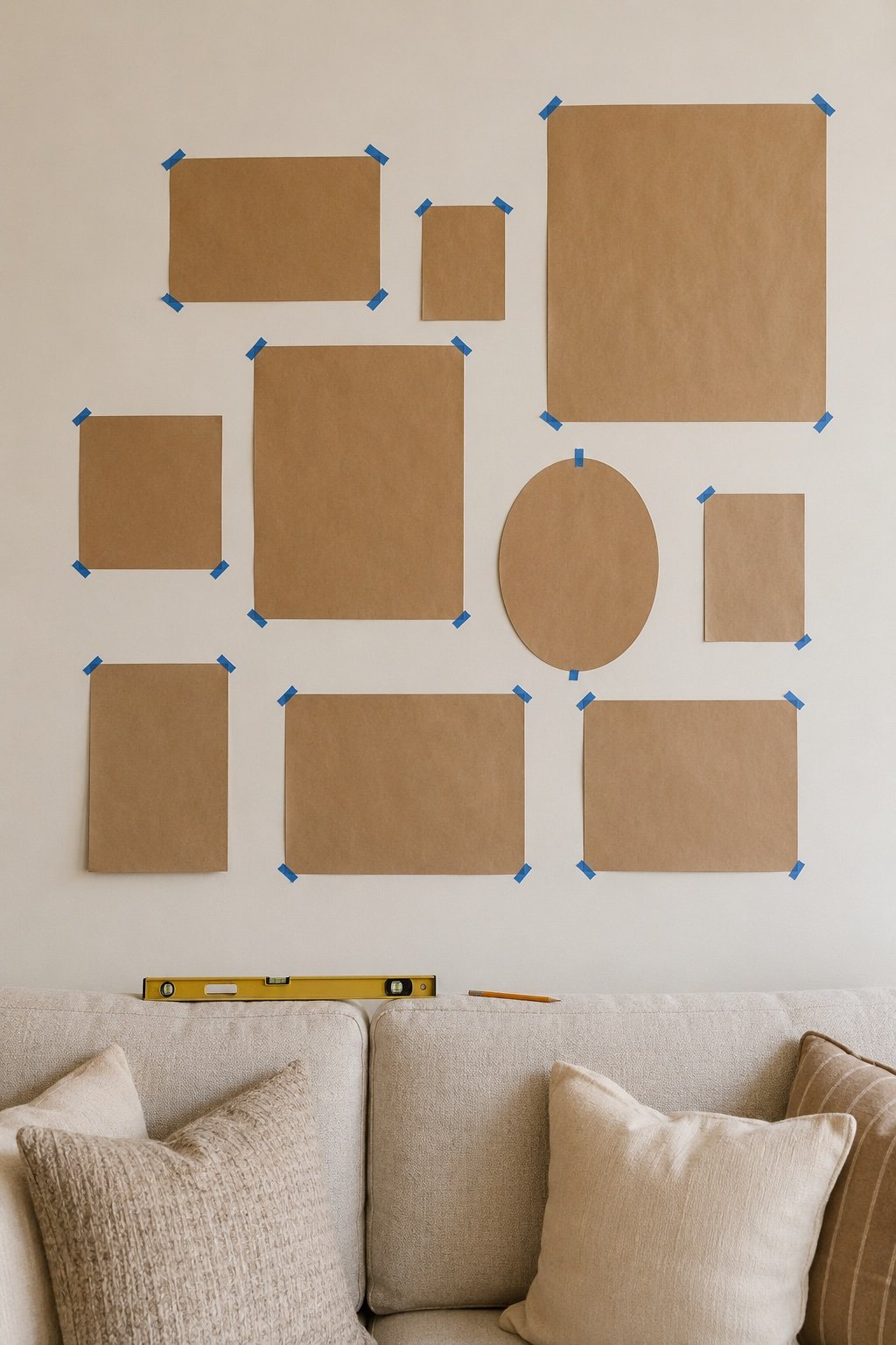
It feels like an unnecessary step and it is the difference between one round of holes and four. It also lets you see the arrangement at actual size, which is the only way to judge it, because a plan on paper always looks better than it hangs.
Alternative: lay the whole arrangement out on the floor first, in the exact footprint of the wall, and photograph it from above. The photo tells you the truth.
What makes it not look like a Pinterest board
Four things, and they’re all about the wall having a life:
- One thing that isn’t art. A small mirror, a plate, a hat, a woven piece, a sconce inside the arrangement. The moment there’s an object in there, the wall stops being a frame delivery system.
- Something with an odd shape. A round frame, an oval, something tiny. It breaks the rectangle rhythm.
- Real photographs, printed. Not the stock print of a mountain. Your own, in black and white, printed properly. This is the single biggest differentiator and it costs almost nothing.
- Room to grow. Leave one gap. A gallery wall that’s finished is a decoration. One with a space for the next thing is a collection, and it’s why the good ones look like they accumulated.
Don’t do this
Skip the word art. Skip the set of nine sold as a set. Skip filling the frames with the paper inserts they came with, which is a thing that happens more than anyone admits. And don’t hang it in the first hour after you’ve bought everything, because that’s exactly what the wall will look like.
The short version
Start with what you already love, mix two or three frame finishes with generous mats, vary the sizes hard, keep a consistent three-inch gap, center the group at 57 inches, and leave one space empty for whatever comes next.
That last part is the difference. The best gallery walls aren’t finished. They’re just current.
Keep Reading
📖 9 Living Room Layout Mistakes (and the Fixes That Cost Nothing)
📖 How to Mix Wood Tones Without It Looking Like an Accident
📖 How to Create a Reading Nook in Any Corner