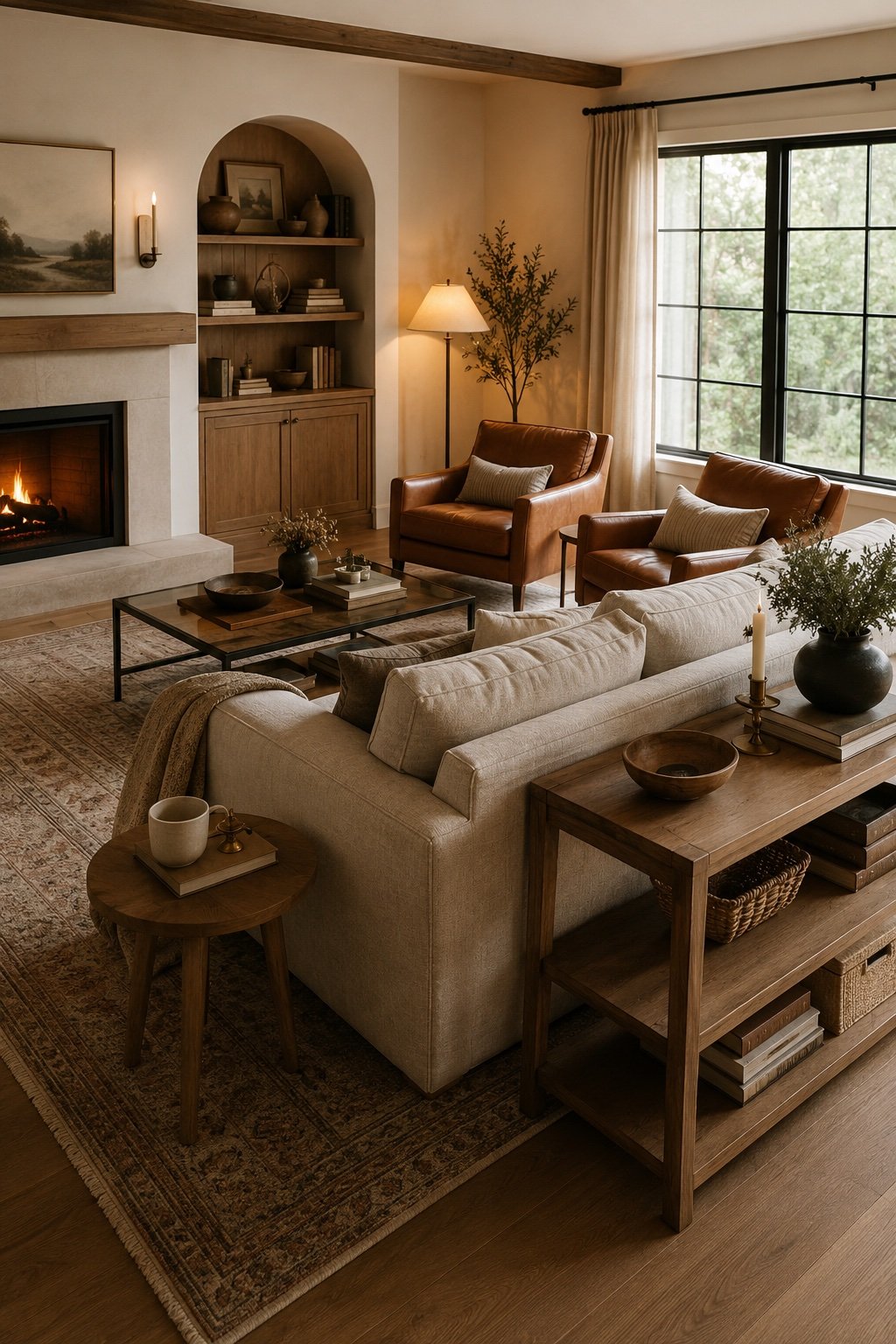
You can buy every right thing and still have a living room that feels off. Nine times out of ten it isn’t the sofa, the paint, or the budget. It’s the layout. The good news is that layout is the one thing you can fix on a Saturday afternoon with nothing but a willingness to push furniture around. Here are the mistakes that show up in almost every room, and the fixes that cost nothing.
Mistake 1: Everything pushed against the walls
This is the big one. We shove the sofa to the wall because it feels like it creates space, and then the room reads like a waiting area with a lonely rug in the middle.
The fix: pull the sofa forward. Even three or four inches of breathing room between the back and the wall changes how the room reads, and in a larger space you can float it entirely with a console behind. The goal is a conversation cluster in the middle of the room, not a perimeter of furniture staring across a void.
Mistake 2: The seating is too far apart
A living room is for talking, and there is a distance past which nobody talks comfortably. If your sofa and chairs are more than about eight feet apart, guests will raise their voices without knowing why, and the room will feel formal in a way you didn’t intend.
The fix: aim for seven to eight feet between facing seats, and about eighteen inches between the sofa edge and the coffee table. Close enough to set a mug down without leaning. That single measurement fixes more rooms than any purchase.
Mistake 3: The rug is too small
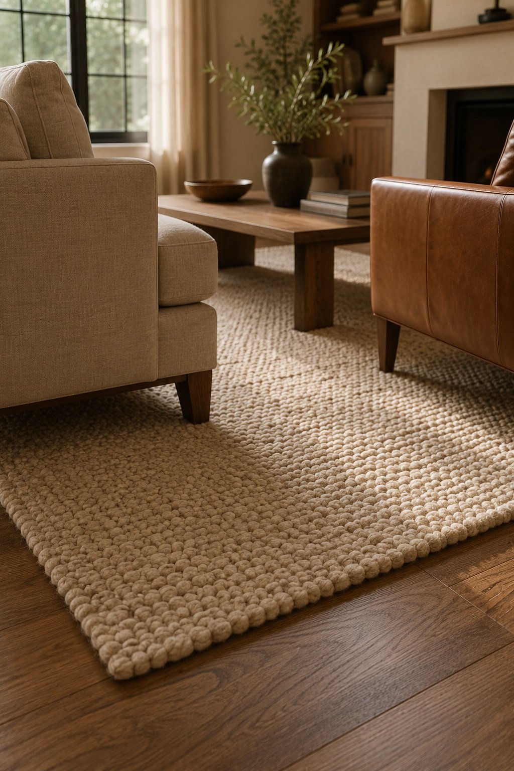
A rug that floats in the middle with every piece of furniture standing off it shrinks the room instead of grounding it. It’s the most common and most expensive mistake, because a rug is not a cheap thing to replace.
The fix: at minimum, the front legs of every seating piece should sit on the rug. That’s the rule that pulls the arrangement together and makes the whole footprint read intentional. If you’re between sizes, always go up.
If you’re rug shopping, our visual guide to the right rug size for every room walks through the exact dimensions per layout.
Mistake 4: Only one light source, and it’s the ceiling
An overhead fixture on its own is why a room feels like a rental at night. It flattens everything, casts hard shadows, and there’s no way to make it cozy.
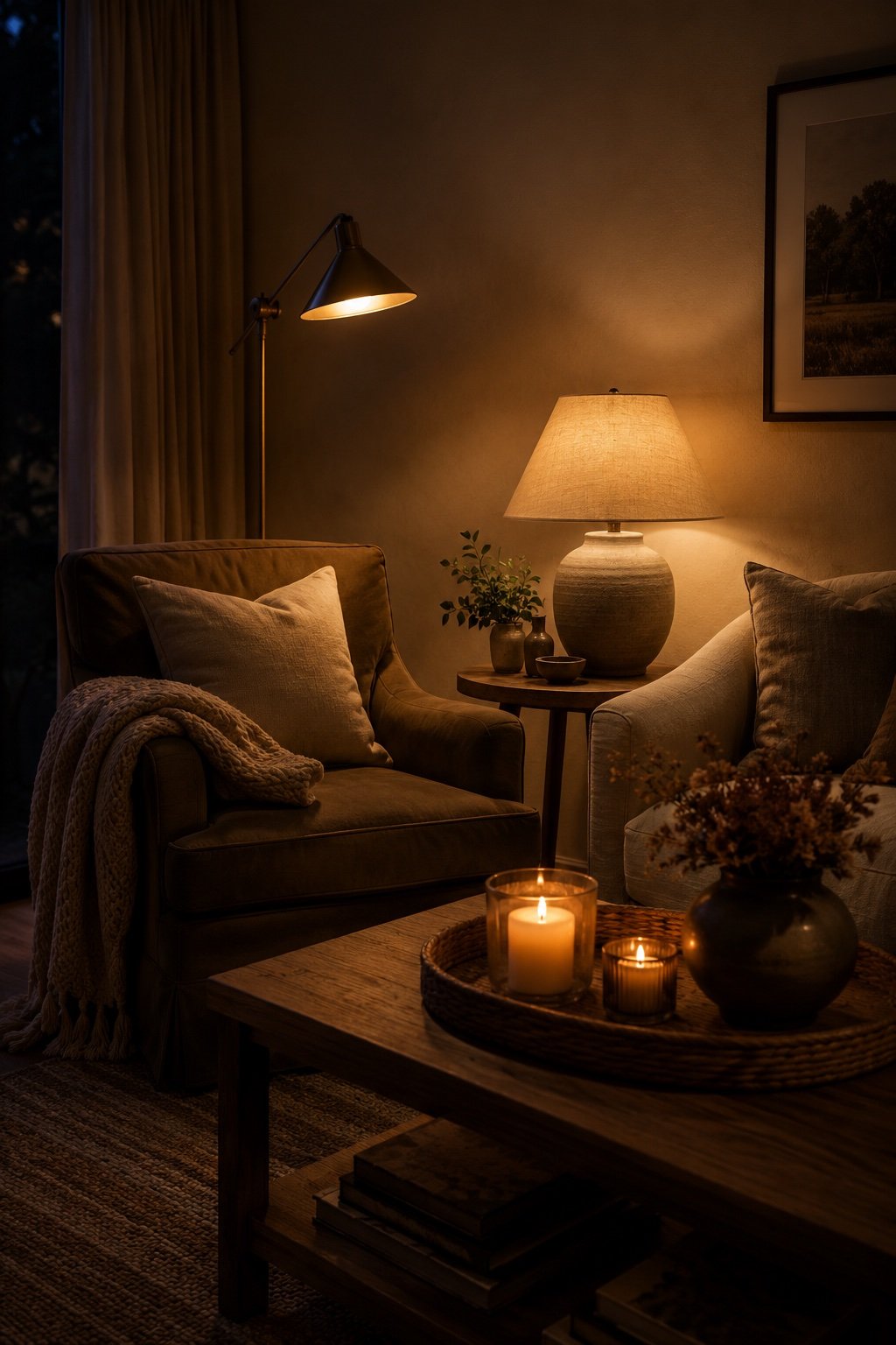
The fix: three light sources at three heights. A floor lamp in a corner, a table lamp on a side table, and something low like a candle or a small lamp on a shelf. Warm bulbs, 2700K, and put them on a switch you’ll actually use. This is the cheapest transformation in decorating, and it’s the one people notice the most.
Mistake 5: No focal point, or two competing ones
Every room needs one thing your eye lands on first. A fireplace, a window with a view, a big piece of art. When there isn’t one, the arrangement wanders. When there are two, say a fireplace on one wall and a television on another, the seating has to choose, and it usually ends up serving neither.

The fix: pick the focal point and commit. If the television and the fireplace are fighting, stack them on the same wall or accept the television as the focal point and stop apologizing for it. A room that admits what it’s for feels better than a room pretending.
Mistake 6: Every piece is the same height
Sofa, chair, console, all sitting in the same horizontal band. The room reads flat even when the pieces are lovely on their own.
The fix: break the line. A tall floor lamp, a plant with some height, art hung a little higher, a leaning mirror. You want your eye to move up and down, not just across.
Mistake 7: There’s nowhere to put a drink
It sounds small. It is not small. If a seat doesn’t have a surface within arm’s reach, nobody sits there. That’s how you end up with a beautiful chair that functions as a laundry rack.
The fix: every seat gets a surface within reach. A side table, a stool, a stack of books, a tray on an ottoman. Once the chair is usable, it gets used.
Mistake 8: Blocked traffic paths
If people have to turn sideways to get through, or the path from the door to the kitchen cuts straight through your conversation area, the room fights you every single day.
The fix: leave thirty to thirty-six inches for main walkways and about eighteen for the secondary ones. Walk the route before you commit. If you find yourself dodging a corner twice, the corner is wrong.
Mistake 9: Art hung too high
Art that floats near the ceiling disconnects from the furniture and makes the walls feel taller in the bad way, with a strange dead band of nothing between the sofa back and the frame.
The fix: center of the piece at about 57 to 60 inches from the floor, eye level for most people. Over a sofa, leave six to eight inches between the top of the sofa back and the bottom of the frame so the two read as one group.
The Saturday reset
Try this before you buy anything. Take everything small out of the room, leaving only the big pieces. Pull the sofa off the wall. Set the seats seven feet apart with a table within reach of each. Add the three lights. Then put back only what earns its place.
Most people find the room they wanted was already in there, just arranged like a furniture showroom instead of a home.
If you only change one thing
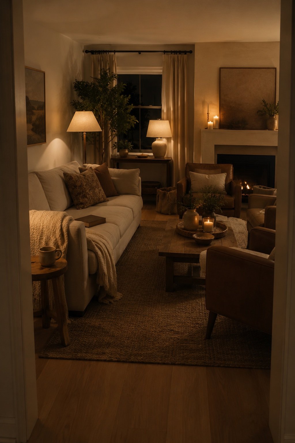
Pull the sofa off the wall and add a lamp at the far end of the room. Two moves, zero dollars, and the space will feel like someone designed it on purpose.
Keep Reading
📖 Gray Boho Living Room Ideas That Feel Warm, Not Cold
📖 27 Cozy Fall Living Room Ideas That Feel Warm, Not Cluttered
📖 Gallery Wall Ideas That Don’t Look Like a Mood Board